The Psychology of Color: How Website Color Schemes Influence Visitor Behavior
The psychology of color plays a crucial role in website design, influencing how visitors perceive and interact with your content. Different colors evoke various emotions and responses, which can be strategically used to enhance user experience. For instance, blue often conveys trust and professionalism, making it ideal for corporate sites, while warm colors like red can create a sense of urgency, commonly utilized in sales and promotional websites. Understanding these associations allows web designers to select color schemes that align with their brand's message and target audience, effectively guiding visitor behavior.
Moreover, the combination of colors can impact a visitor's overall experience. A coherent color palette not only enhances aesthetic appeal but also improves navigation and comprehension. For example, using contrasting colors for calls to action can significantly improve click-through rates, as they stand out against a background. According to studies, well-chosen color schemes can lead to a higher conversion rate by making users feel more comfortable and engaged. Thus, businesses should consider the psychological implications of their color choices to foster a positive relationship with their visitors.
Choosing the Right Color Palette: Tips for Designing an Effective Website
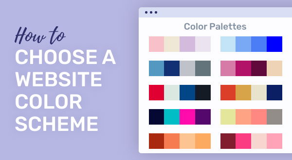
Choosing the right color palette is a crucial step in designing an effective website. Colors do not just enhance aesthetics; they also evoke emotions and can significantly influence user behavior. Start by identifying your brand's identity and the message you want to communicate. Utilize tools like color wheel basics to understand the relationships between colors—complementary, analogous, and triadic schemes can be particularly effective in creating visual harmony. Remember, your primary color should reflect your brand's personality, while secondary colors can add depth and variety to your design.
When implementing your color palette, consider accessibility and usability. Strive for a balance between visually appealing colors and text readability. Maintaining high contrast between background and text colors is essential for ensuring that all users can navigate your site comfortably. Additionally, be mindful of color meanings and cultural implications, as different colors can carry various connotations in different contexts. Incorporating feedback from users can also provide valuable insights into how your color choices are perceived, ensuring your design is not only beautiful but functional as well.
Can Color Choices Increase User Engagement? A Look into Website Design Trends
In the realm of website design, color choices play a pivotal role in influencing user engagement. Research suggests that users often form a judgment about a website within the first few seconds of visiting it, and color is one of the most significant elements they notice. A well-thought-out color palette can evoke emotions, create brand recognition, and guide user behavior. For instance, warm colors like red and orange can generate excitement and urgency, making them effective for call-to-action buttons, while cool colors like blue and green tend to instill a sense of trust and calmness, ideal for financial and health-related sites.
Moreover, as design trends evolve, so do the strategies that incorporate color for improved user interaction. Web designers are now experimenting with vibrant gradients and bold contrasts, which not only enhance visual appeal but also help to direct users' attention to key areas of the page. Implementing colors that align with the brand identity is paramount, as it contributes to a cohesive experience that resonates with the audience. Ultimately, the right color choices can significantly enhance user engagement, leading to higher conversion rates and a more fulfilling browsing experience.
