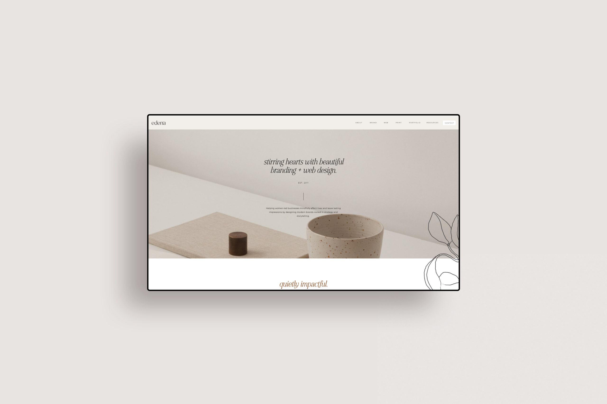
Understanding the Principles of Minimalist Web Design
Understanding the principles of minimalist web design is essential for creating visually appealing websites that provide a seamless user experience. Minimalist design emphasizes simplicity, functionality, and the effective use of negative space. By stripping away unnecessary elements, designers can highlight the core content, enhancing both loading times and user engagement. Key principles include:
- Clarity: Focus on the main message without distractions.
- Functionality: Every design element should serve a purpose.
- Visual Hierarchy: Use size, color, and layout to guide users naturally through the content.
Moreover, minimalist web design improves accessibility, allowing all users to navigate websites with ease. This approach often leads to clean aesthetics, ensuring that visitors can concentrate on what truly matters. Not only does this design philosophy streamline the user experience, but it also aids in reducing bounce rates, making it a valuable strategy for SEO. Embracing these principles can lead to higher search engine rankings and increased traffic to the site. For more insights, you can check the comprehensive guide on NNG's article on minimalist web design.
Why Minimalism Can Enhance User Experience
Minimalism is a design principle that emphasizes simplicity and the removal of unnecessary elements. By focusing on only the essential components of a website or application, users can navigate through content more easily and intuitively. This streamlined approach reduces cognitive overload, allowing users to concentrate on the task at hand without being distracted by extraneous visuals or information. According to a study by Smashing Magazine, users have a better experience when they encounter uncluttered designs that guide them through a clear pathway.
Beyond aesthetics, minimalism enhances user experience by improving loading times and overall performance. A less crowded layout typically requires fewer resources to render, resulting in faster page load times, which is crucial in retaining users. Research from Neil Patel indicates that even a one-second delay in loading can lead to reduced conversion rates. Ultimately, adopting a minimalist approach not only simplifies the user interface but also contributes to a more efficient and pleasant experience for users navigating through your site.
How to Create a Stunning Website with Less
Creating a stunning website doesn't always require a hefty budget or extensive resources. In fact, you can achieve impressive results by focusing on the essentials. Start by selecting a user-friendly content management system (CMS) like WordPress or Wix, which offer numerous templates tailored for aesthetics without compromising functionality. Utilize responsive design to ensure your site looks great on all devices, maximizing user engagement and improving SEO performance.
Next, embrace the power of minimalism. A clean layout with ample white space can significantly enhance user experience. Consider employing high-quality images from resources like Unsplash or Pexels that convey your brand's message effectively. Don't forget to optimize your images and content for search engines by incorporating relevant keywords, making it easier for potential visitors to find you online.
